Vizora.
A self-service analytics dashboard that turns raw CSV / JSON into interactive charts, augmented with natural-language queries via Gemini.
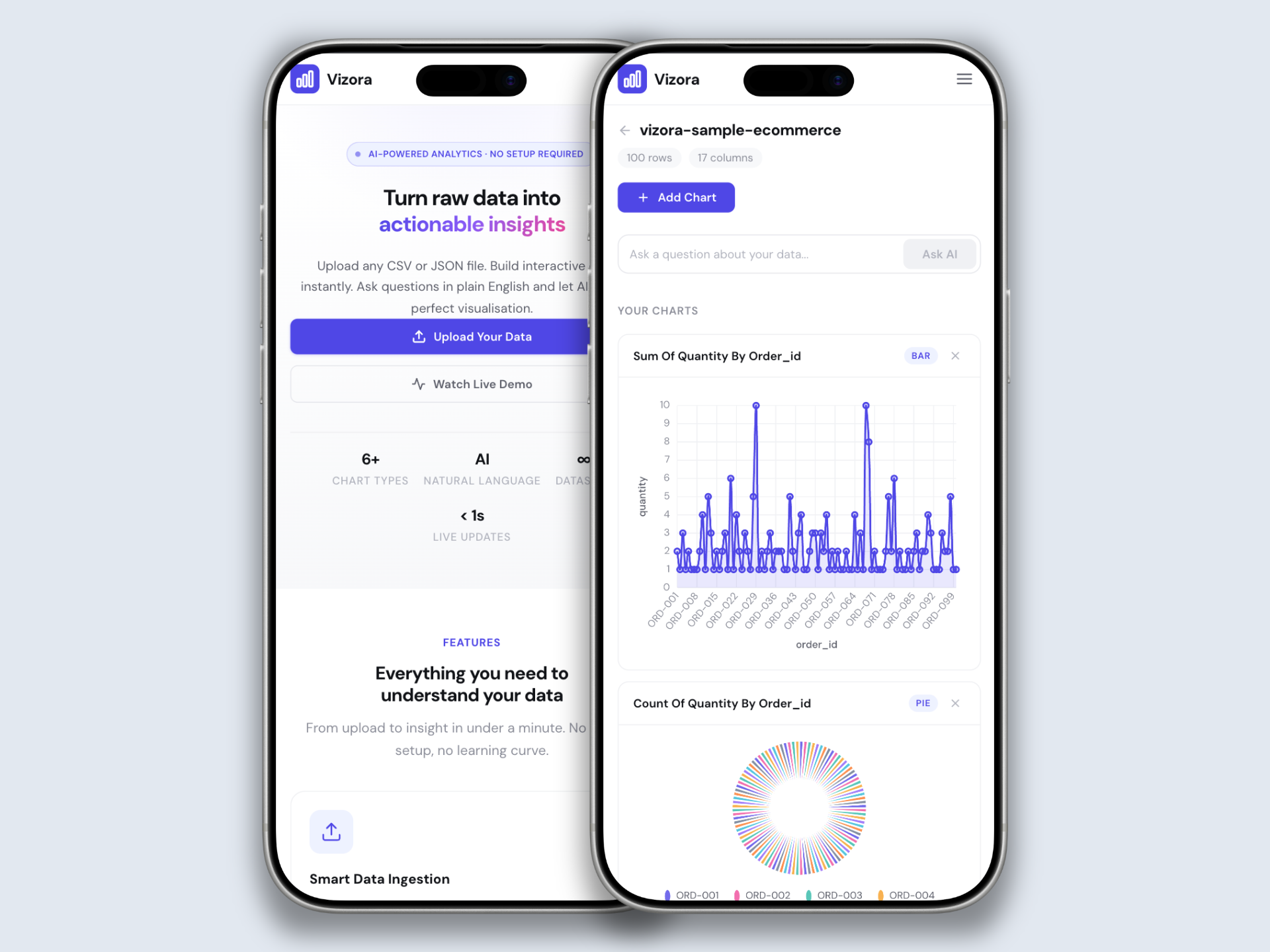
Vizora lets users upload a dataset and instantly explore it visually. A drag-to-axes chart builder covers the standard cases; a Gemini-powered natural-language layer covers the rest. Server-side aggregation keeps the wire payload tiny, and an SSE feed streams live data into charts without polling.
What this project set out to solve.
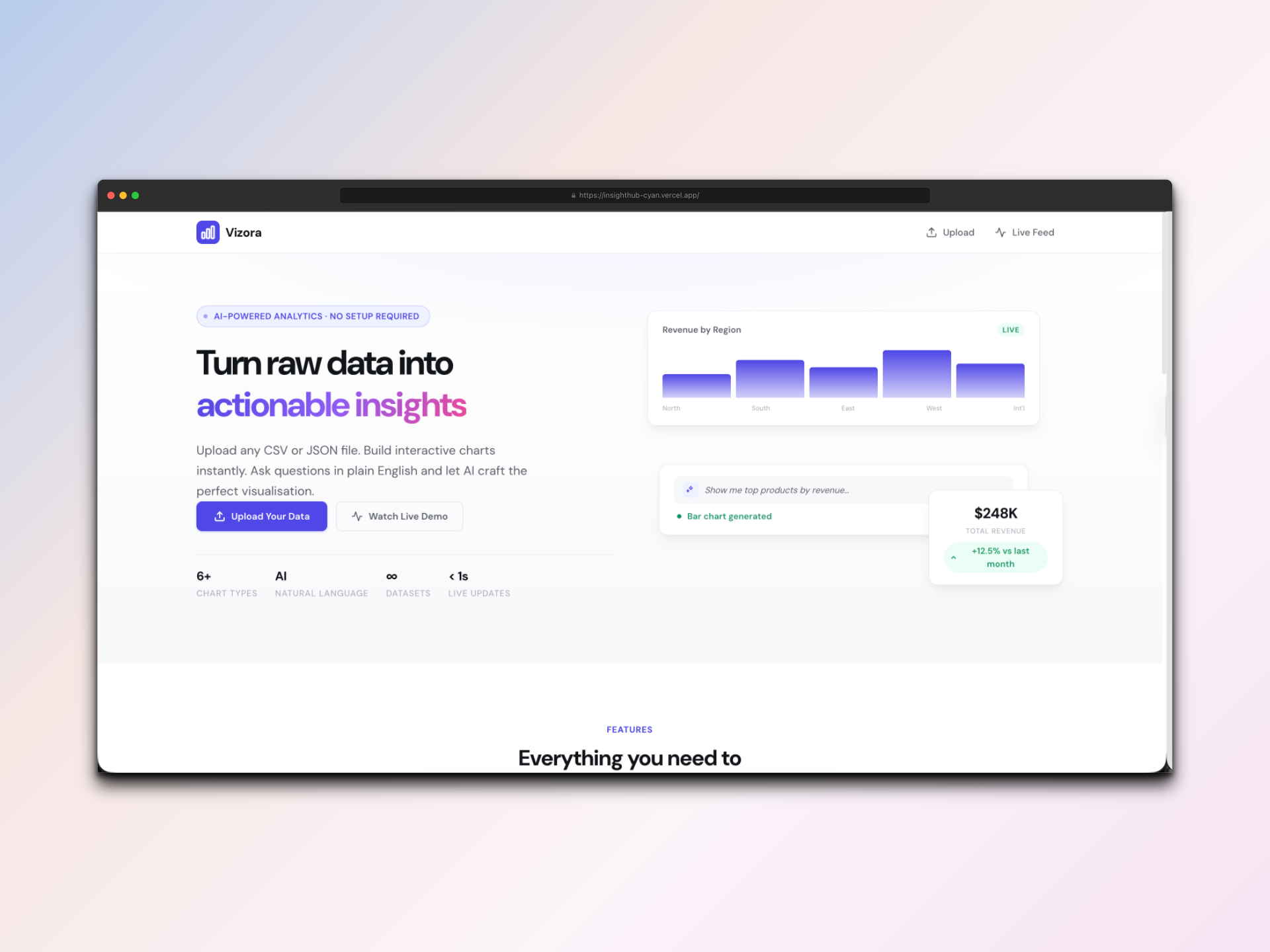
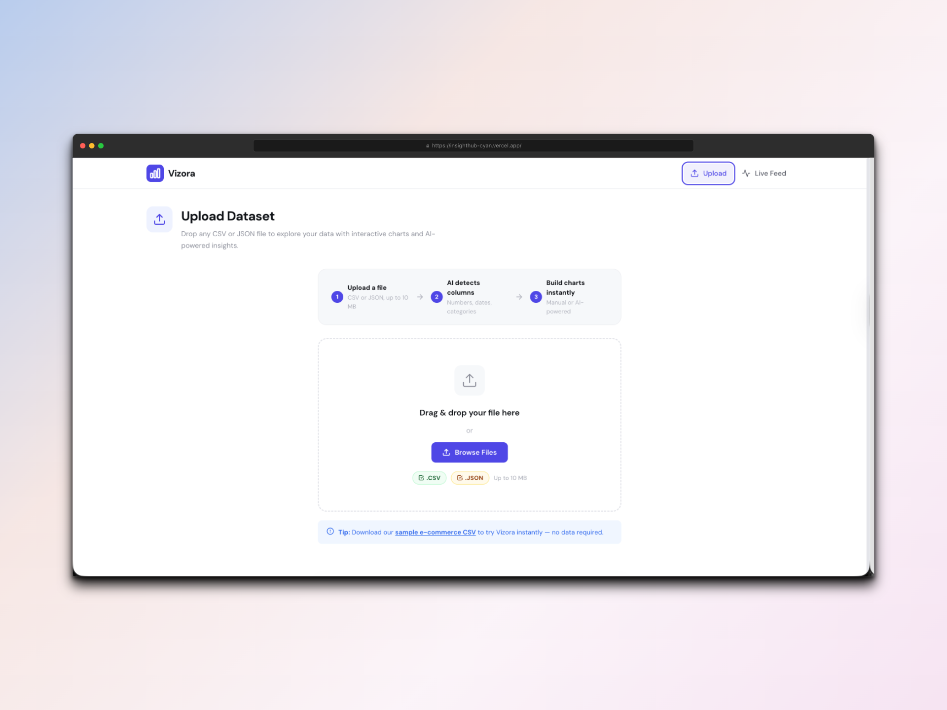
Non-technical teams have data sitting in spreadsheets, but the path from spreadsheet to chart usually means learning a heavyweight BI tool. I wanted to compress that path to a single screen: upload a file, see a chart, ask a follow-up question in plain English.
The interesting technical question was where to put the work: parsing and aggregating on the client is fast to ship but breaks on large files; pushing it server-side keeps payloads small but adds latency. The right answer is server-side, with the client treating the API as a queryable view.
How it came together.
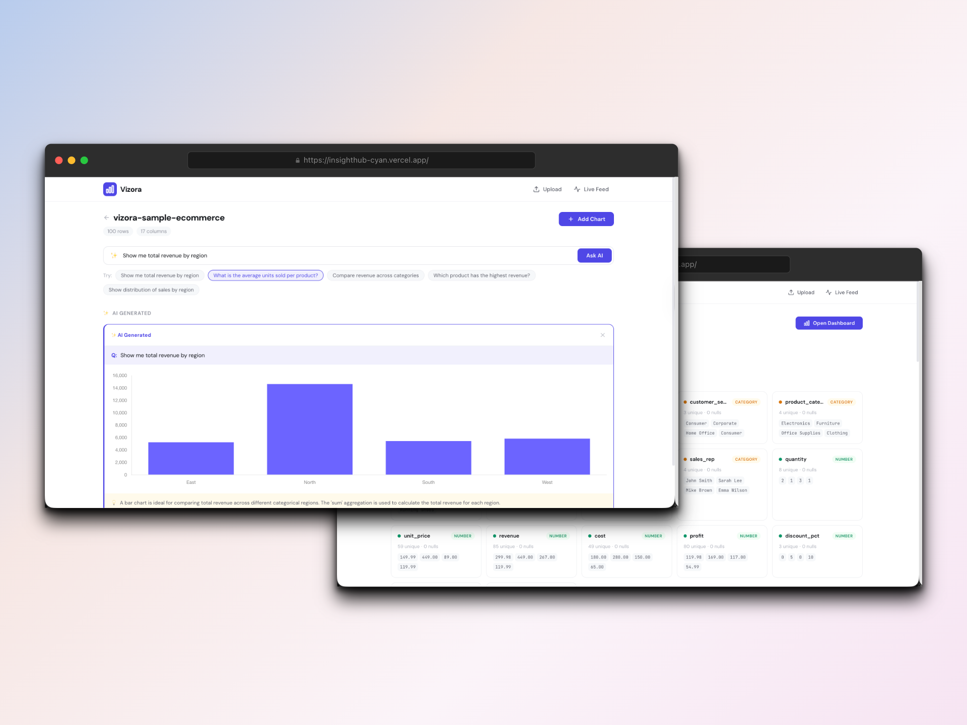
On upload, the server parses CSV / JSON, stores the dataset in MongoDB, and exposes an aggregation endpoint. The chart builder is a visual mapping UI (drag fields to X, Y, color) that translates to an aggregation query the server resolves.
For Gemini I built a structured-output prompt that returns chart configurations as JSON. The client validates against a strict schema before passing the spec to Chart.js. Invalid model output is intercepted and routed back through a clarifying prompt instead of crashing the render.
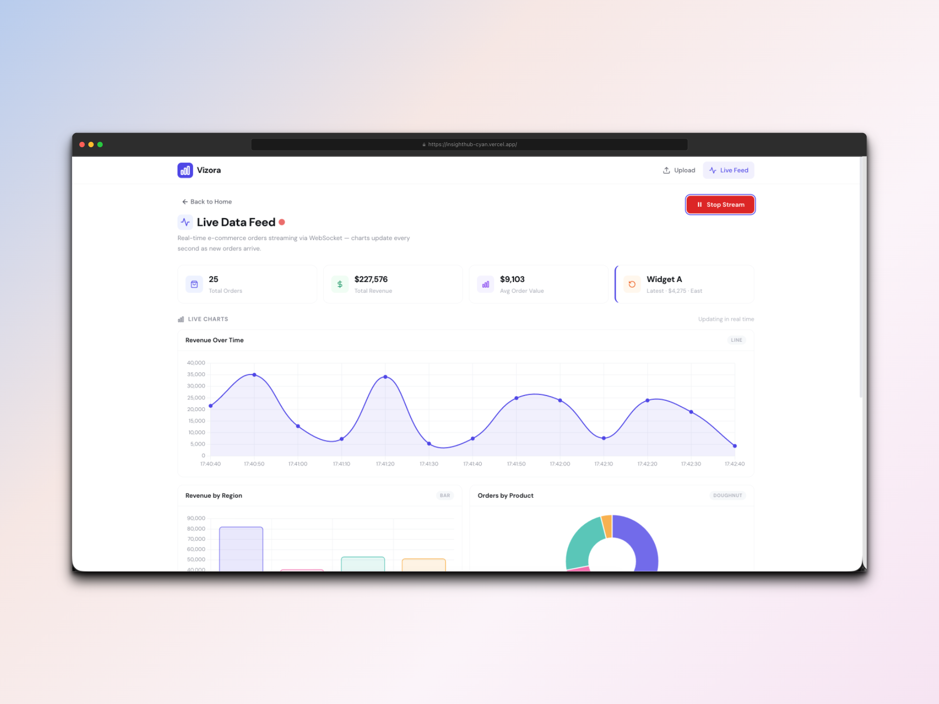
Live data uses Server-Sent Events. SSE was the right fit over WebSockets because the stream is server → client only and reconnect semantics come for free.
Stack & structure.
Frontend
- Angular 21 (signals)
- Chart.js for rendering
- EventSource for SSE
- Visual mapping UI for the chart builder
Backend
- Node.js + Express
- MongoDB for datasets and saved charts
- Gemini SDK for NL queries
- SSE endpoint for live data
Aggregation runs server-side so the client never ships raw rows over the wire.
What you can actually do.
CSV & JSON ingest
Drop a file, server parses + indexes it, ready to chart in seconds.
Visual chart builder
Drag fields to axes. No SQL, no config files.
AI natural language queries
Ask "show revenue by region last quarter" and Gemini returns a chart spec.
Server-side aggregation
Heavy lifting stays on the server; the wire payload is just the rendered series.
Live data feed
SSE pushes new data points into open charts without polling.
Mobile-responsive
Dashboards reflow cleanly down to phone breakpoints.
In motion.
What was hard, and what I took from it.
Validating AI output
Free-form Gemini responses occasionally returned chart specs that Chart.js would reject. I added a JSON-schema validation layer between Gemini and the renderer. Invalid specs trigger a clarifying re-prompt instead of a UI crash.
SSE backpressure
On large datasets the live feed could outpace the renderer. I throttled server emits and batched client updates into RAF ticks, so the chart never has more than one paint per frame.
What I shipped.
- Self-service analytics tool covering ingest, visual building, AI queries, and live data in one product.
- Aggregation moved fully server-side, keeping the client lightweight even with large datasets.
- Demonstrates AI integration with hard contracts, real-time data via SSE, and signal-based Angular.